Downspouts are one of the most visible parts of a gutter system. They run vertically down the side of your house, often near the front door, along the garage, or beside windows where visitors and neighbors see them every day. When downspouts match the color of your home, they blend into the exterior and become nearly invisible. When they do not match, they stand out as an afterthought that detracts from the overall appearance of the house.
Many homes in the Portland metro area have mismatched downspouts. Sometimes the original downspouts were replaced with whatever color was available at the hardware store. Sometimes the house was repainted but the gutters and downspouts were left in the old color. And sometimes the builder installed the cheapest white downspouts on a home with brown trim simply because white was the default. Whatever the reason, the result is the same: a visual distraction that makes an otherwise attractive home look unfinished.
The Visual Impact of Color Coordination
Color coordination is one of the simplest ways to improve curb appeal, and gutters and downspouts are an easy place to make an impact. When the gutter system matches the trim, fascia, or siding color, it creates a clean, unified look. The eye moves across the exterior without snagging on a contrasting element that does not belong. Real estate professionals consistently note that homes with coordinated exterior details photograph better, show better, and create a stronger first impression with potential buyers.
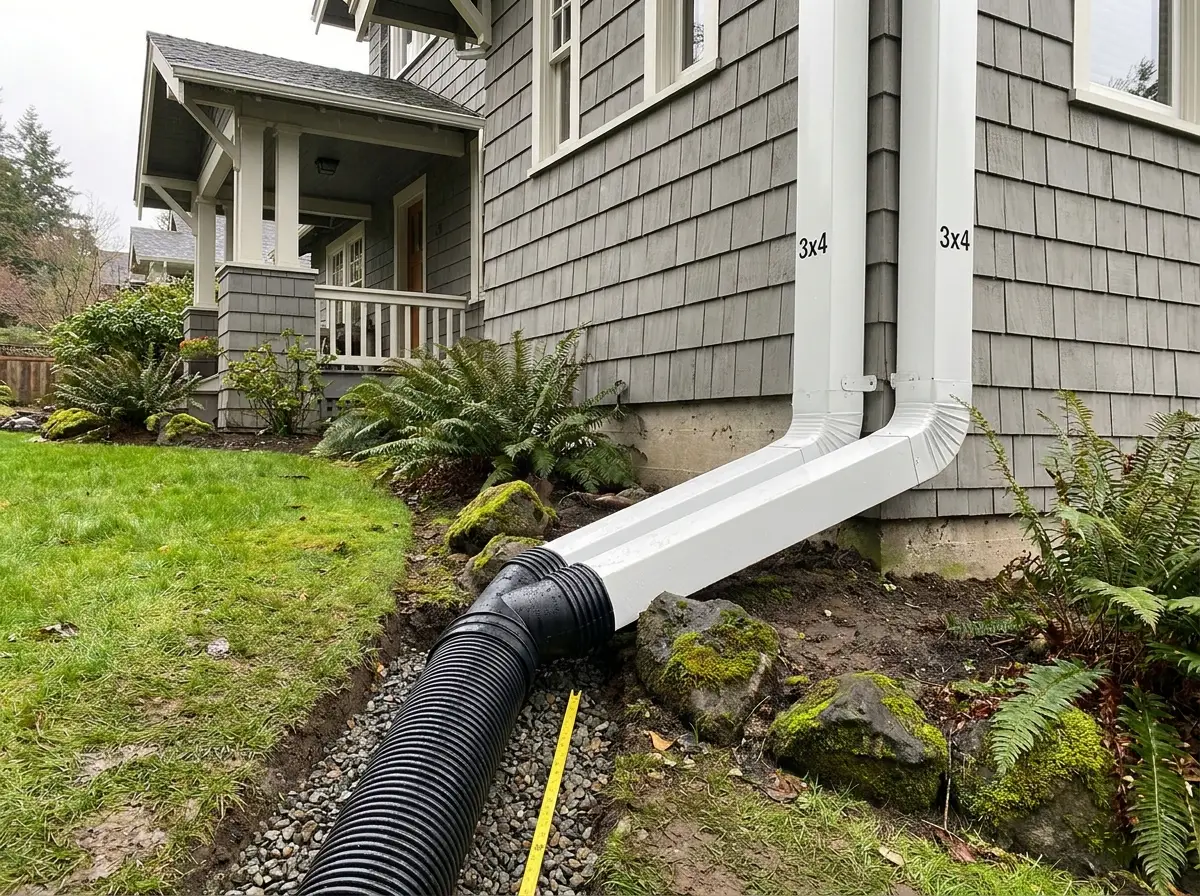
The most common approach is matching downspouts to the trim color. If your home has white trim, white gutters and downspouts create a seamless look. If your trim is dark bronze or black, matching the gutter system to that color makes the entire roofline appear intentional and well maintained. Some homeowners prefer to match the siding color instead, which makes the downspouts nearly disappear against the wall. This is especially effective on homes with long vertical downspout runs where a contrasting color would draw too much attention.
On homes with two tone color schemes, the gutter system offers an opportunity to tie the palette together. For example, a home with gray siding and white trim might use white gutters along the roofline to match the trim, and then switch to gray downspouts where they run down the siding. This dual color approach takes more planning but creates a polished result that shows attention to detail.
Available Colors and Factory Finishes
Aluminum gutters and downspouts are available in a wide range of factory finished colors. Most manufacturers offer a standard palette of 20 or more colors that covers the vast majority of home exteriors. The most popular colors in the Portland area include white, almond, linen, clay, musket brown, tuxedo gray, dark bronze, and black. These cover the color families used on most Pacific Northwest homes, from traditional craftsman styles to modern contemporary builds.
Factory finished aluminum uses a baked enamel coating applied at the manufacturing facility. The aluminum coil is cleaned, primed, and coated with enamel paint that is then cured in an oven at high temperature. This process bonds the paint to the metal at a molecular level, creating a finish that resists peeling, chipping, fading, and chalking for decades. Factory finished gutters and downspouts installed 20 years ago often still look nearly as good as the day they went up, with only minor fading from UV exposure.
This factory finish is far more durable than field applied paint. Painting raw aluminum gutters or downspouts with a brush or spray gun produces a finish that begins to peel within a few years, especially in Oregon where constant moisture works under the paint layer and lifts it away from the metal. If you need a specific color that is not available in the standard factory palette, custom color matching is possible through specialty suppliers, though it adds cost and lead time to the project.
Coordination Tips for Portland Area Homes
Portland has a diverse mix of architectural styles, and each has its own conventions for color coordination. Here are some guidelines based on the most common styles in the metro area:
- Craftsman homes typically feature warm earth tones like brown, olive, and tan. Dark bronze or musket brown gutters and downspouts complement these palettes without competing with the architectural details that define the style.
- Mid century modern homes often use clean, minimal color schemes with neutral siding and contrasting trim. Black or dark bronze downspouts pair well with the strong horizontal and vertical lines of mid century design.
- Contemporary homes with flat or low slope roofs tend to use bold contrast. Black gutters and downspouts on white or light gray siding create a sharp, modern look that emphasizes clean geometry.
- Traditional ranch homes work well with gutters and downspouts that match the trim exactly. White on white, almond on almond, or clay on clay creates a quiet, unified appearance that does not draw attention away from the landscaping or entry.
- Painted Victorian and Queen Anne homes with multiple accent colors can use gutters as part of the color scheme. Matching the gutter to one of the accent trim colors ties the roofline into the rest of the exterior palette.
When choosing a color, bring a physical sample of your siding or trim to compare against the gutter color swatches. Digital photos can distort color depending on lighting and screen calibration. A physical comparison in natural daylight gives you the most accurate match.
If you are replacing your gutters and downspouts, color matching is included in the process. There is no extra charge for choosing a color from the standard palette, so there is no reason to settle for a mismatched system. The right color choice turns a functional component into an asset that improves the appearance of your home for years to come.